Brand identity
Identity design, re-design and brand development for multiple clients.
Role |
Identity designer |
Type |
Branding, identity design |
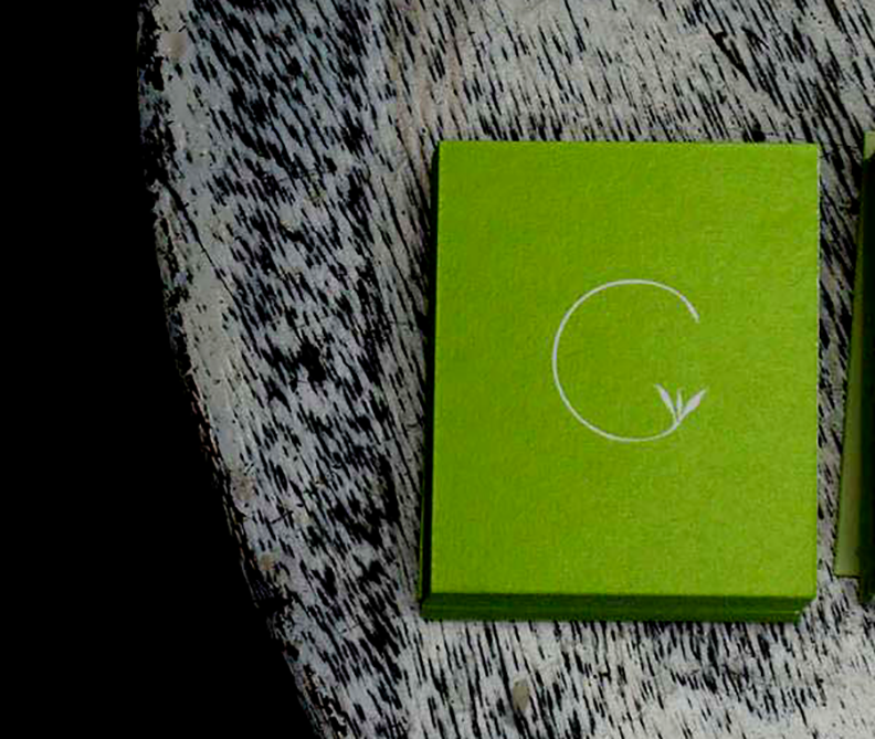
THE BLUE HILL DIALECT
A Wildlife Photographer from North-East India wished to start an initiative to bring forward the ethnicity, culture, wildlife and people of North-East through his photographs. I was given the responsibility to brand its identity and give it a name. After a series of brain storming sessions and discussions I came up with The Blue Hill Dialect.
THE BLUE HILL DIALECT is an endeavor to showcase the best of the blue hills way of life, the rich culture and traditions of its amazing tribes with a concerted effort through visual stories. Here the term ‘Blue Hill’ is derived from Assam which is also called the Land of the Blue Hills and Red Rivers. North East India is a region blessed with several local dialects that add to its diversity. The word ‘Dialect’ is used to express the common Visual Language of North East’s beauty through the photographer’s lens. TBHD’s logo portrays a Camera’s Landscape Icon as seen on autobuttons. The original mountain and cloud that appear in the icon are replaced by a simplified hill and a moon. The stylised rectangle derives a slight inspiration from the instagram vintage polaroid camera logo. Its rectangular form has been given organic styling. One-horned Rhino is a global symbol representing Assam and North-East India. Its silhouette is inserted to symbolize the land that is NE India. The idea was to use a combination of Brand Mark and Emblem mark styles of Logo Design to communicate without the words and bring about an ease for people to associate with the initiative.
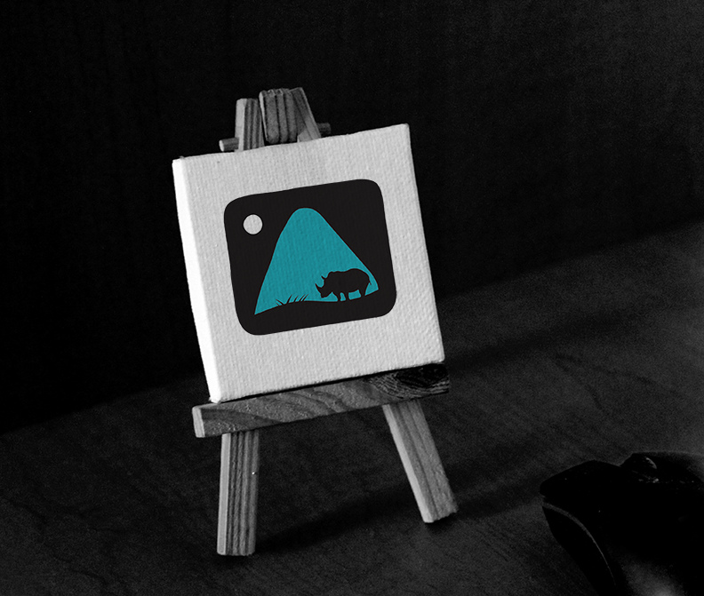
THE BLUE HILL DIALECT – www.facebook.com/thebluehilldialect
SILVER SPIDER KNITTING LTD.
I had the opportunity to do a make-over of Silver Spider Knitting Ltd. – a brilliant knitwear fashion manufacturing company based out of Toronto. The brief was to re-brand its visual identity by using the old elements. I proposed to create a contemporary version of the existing spider icon by using elements of geometry. The inspiration was the high-end knitwear technology machine needles which can are very efficient and gives the spider a futuristic look-and-feel to express that it can create a stronger web, indicating the company's advancement towards producing high quality products with the latest in knitwear technology. The brand colors remained the same. I also coined the copy for its tagline "Kniting is live" to communicate that this craft although considered dead is alive and is capable of producing a lot of important articles for the apparel and accesssory industry in Canada
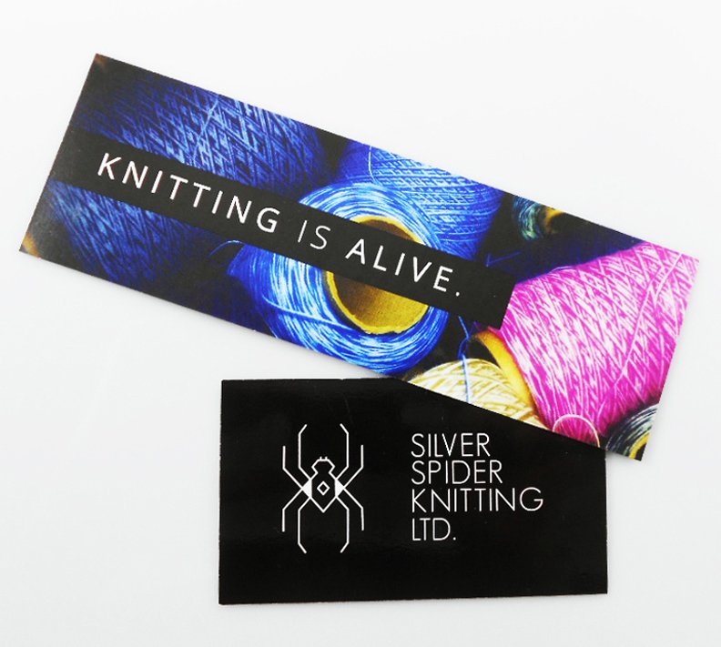
SILVER SPIDER KNITTING LTD. – www.silverspiderknit.com
[O]BSCURA
There was a time in the online social media marketing scenario when Indian photographers started their FB pages with names like ‘XYZ Photography‘, ‘Dash dash Photography‘ in order to promote themselves. People started using part of their names or initials so much as if they were bound to use the syntax:
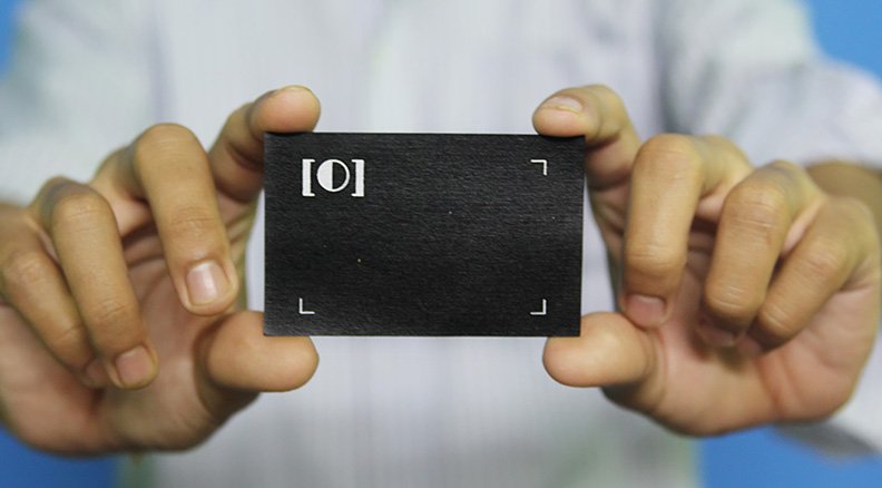
[O]BSCURA – www.facebook.com/obscurabykbd
ULTIMAT
Aricia/KSO India wanted to develop a brand for its doormats product line in their home decor section. Their wishlist included the following: a simple one-word identity, the name should be incorporated in the logo and it should speak about their high-quality products (doormats).I was inspired by the English word ‘ULTIMATE’ to create ULTIMAT. In English language, ‘Ultimate’ is defined as ‘the best achievable result of a process’. Similarly ULTIMAT communicates that my client’s mats (products) are the best/ideal outcomes of their imagination & craftsmanship. Symbolizing perfection & supreme-ness, ULTIMAT resonates their (doormats) high-quality standards.
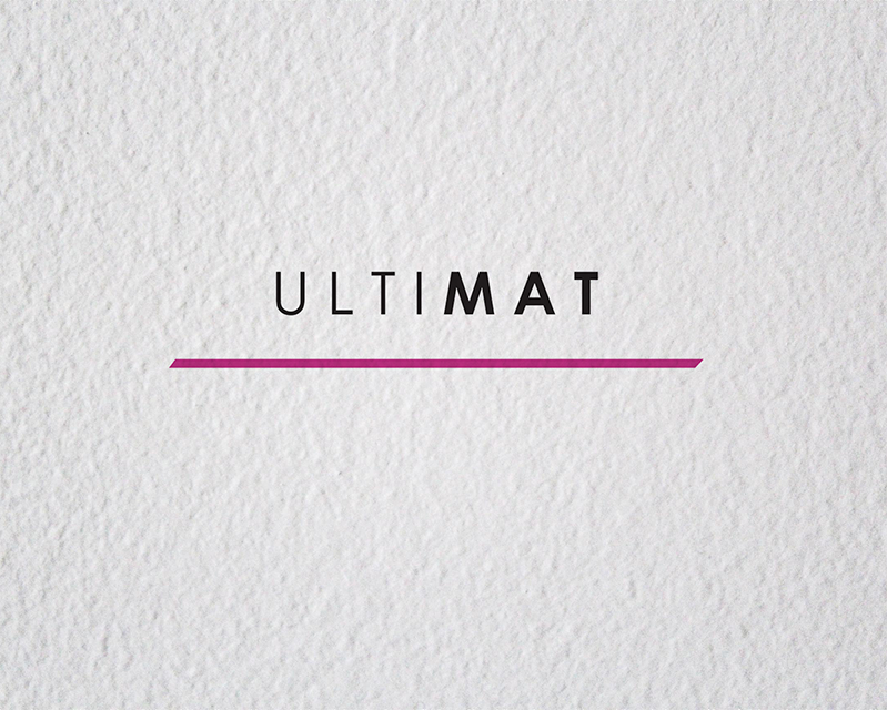
ULTIMAT – Doormat product line for Aricia International.
CHENEHI GREENS
I like drinking hot beverages. Do you? It seems, coffee has become a major addiction with the working class, hot chocolate is a kids delicacy & Green tea is turning to be a favorite with the health conscious. The North-Eastern state of India, Assam has an abundance of small tea growers. Majority of what they churn out is the inorganic variety-Orthodox. But, with the increase of endorsements by health magazines & considering its international demand, Green Tea is taking the lead in Tea business in Assam. There are a few environment conscious tea growers who have realized the potential of green tea & are marching ahead in the path to manufacturing tea in natural, organic environments in Assam. Chenehi Tea Farm is one such a Small Business Initiative. Founded by an agriculturalist & a pioneer of organic tea farming in North-East India, Dhiren Phukan, Chenehi Tea Estate produces natural, hand-made Assam Tea. It also takes pride in being one of the first tea gardens’ from Assam to export Green Tea overseas to Canada. In one of the talks by the Chief Minister of Assam that I attended, the audience giggled when he said ‘We Assamese (people of Assam) don’t know how to market ourselves well’. I chuckled too at his statement. But somehow I find his words correct when it comes to the branding scenario of SMBs in Assam. Business doers readily pick Adidas, Allen Solly, Revlon etc. just for brand name-sake but they hesitate to invest in branding their own business/products. Some because of ignorance, budget etc. Others, because of lack of good branding knowledge & direction. I’m yet to find out the reality that so many smart business people still don’t understand the power of a brand. While working with Small businesses, I realized that the one thing which has the most dramatic impact on the success or failure of a modern-day business is also sometimes the least understood.
While volunteering with a friend cum entrepreneur for development of small scale industries in North-East India, I happened to meet Dhiren Phukan-the man behind Chenehi Tea Farm. On one of the occasions, he gifted me a sealed pack of fresh Green tea from his new batch. I brewed some of that tea when I got back home. Such was the flavor & aroma that I am now an official fan & an addict of Dhiren’s tea. But, when my eyes turned to the logo on the packaging, I was disappointed. Such good tea needs to be respected. And by respect, I mean branded well. I don’t blame this man from rural settings for holding no knowledge about branding & identity. I am unhappy with the designer from the city who charged him grands for such a logo. I felt as if it was my responsibility to help Dhiren & his awesome Green tea. My personal love for the beverage was another reason for taking up this re-branding project.
CHENEHI GREENS – Green teas
LYN MOVEMENT
Love Your Neighbour or LYM Movement is an all-volunteer, not-for-profit organization founded by women, for women. They are driven by a passion to empower women to become confident community members. They advocate the sharing of resources and talents in local and global communities with a belief in fairness and respect. It is my privilege to be part of such a noble cause. During its formation last year, I had volunteered to sculpt their visual identity. The team was looking to use the letters L,Y,N together which would evoke a feeling of love, togetherness, and standing by each other. I derived my final inspiration from the ‘holding hands’ human gesture which symbolizes support, morale booster, instills confidence. I used this philosophy in my design to mould the letters in order to form LYN icon.
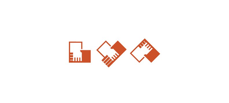
LYN/LOVE YOUR NEIGHBOUR MOVEMENT – www.lynmovement.com
NOEL BENJAMIN
While working on creating a branding strategy for a BrandEq client, one of my tasks in the project was to conceptualize an identity for International Jazz musician and gospel singer – Noel Benjamin. The brief was to create a Type dominated logo with his name. Sophisticated, black, minimal and bold were a few of the keywords. I guised the letter ‘J' in 'Benjamin’ in the form of a musical note to add a hint of music element to the identity. That really worked.
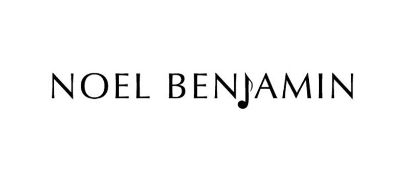
NOEL BENJAMIN MUSIC – www.noelbenjaminmusic.com
Like how I do branding? Let’s Chat. Drop me a message at mailbox.ruchikaur@gmail.com