Product

Mini case-studies from product experience improvement projects for TI.com

Role
Visual Designer (UI/UX)
For
Texas Instruments (TI.com)
Type
UX, UI, Visual Design

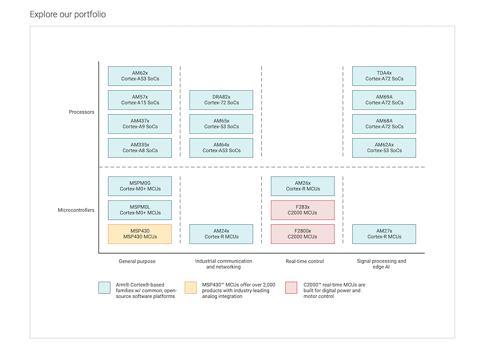
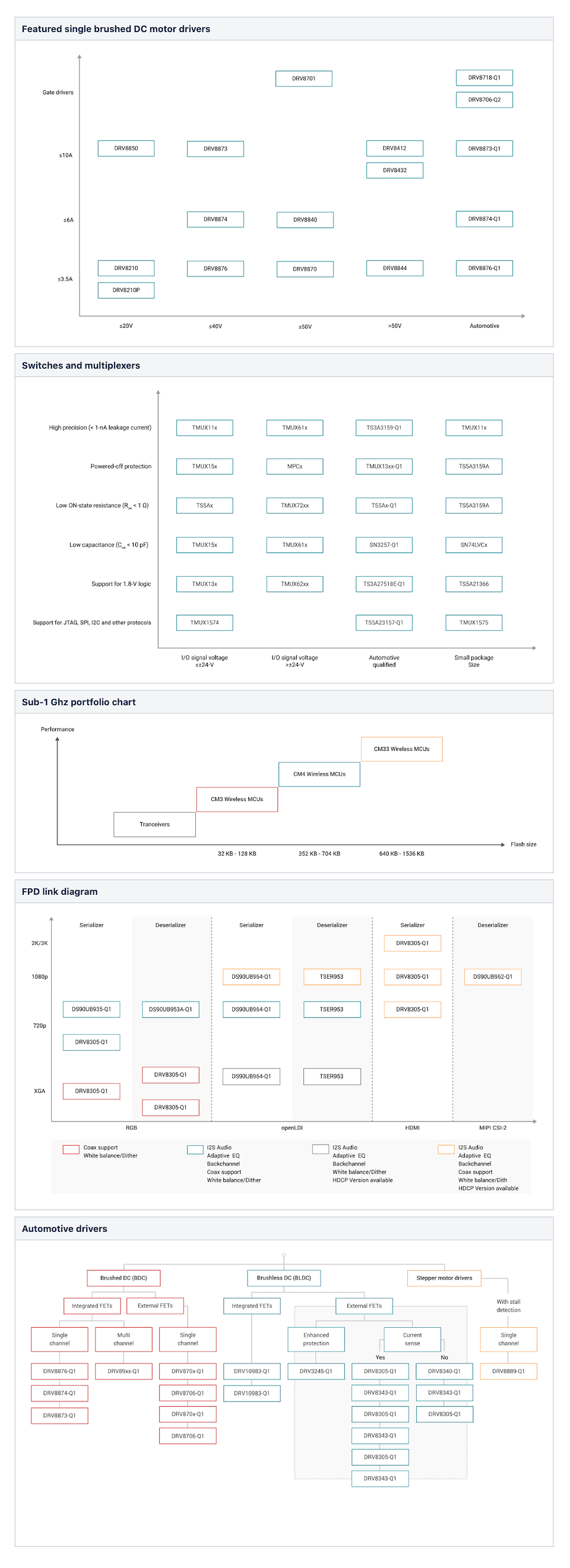
Visualization of product portfolio


At Texas Instruments, I was part of very ambitious project of redefining product portfolio for users in product overviews pages on TI.com

I created interactive graphical visualization for product portals so that users can easily visualize a portfolio and take the next step in selection in their user journey. This improved navigation across expansive portfolio and helped users easily select a device which wasn't earlier possible as the existing visual diagrams/infographics were static, had chaotic information and some didn't even adhere to TI's visual standards.


To comply with my non-disclosure agreement, I have omitted and obfuscated confidential information in this case study.

The Problem


Disconnected visual representation of product portfolio in product overview pages caused roadblocks in navigation for TI.com users (seasoned electronic engineers, students of electronic engineering, procurement people from other companies who build using TI products).
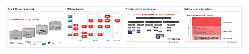
  • Lack of a common data visualization standard for product portfolio. Existing data visualization were wide ranged - from x-y graphs, flowcharts, block diagrams etc.
  • Existing visualizations were unable to provide further interactions to the user for viewing the expansive portfolio which hindered information gathering and affected buying.
  • The Solution


    Discovery, Research & Analysis


  • Existing data visualizations were static in nature and lacked interactive ability.
  • Diagrams of portfolio representation didn't follow a common style which could be confusing to the users due to lack of a memorable pattern and cause brand mistrust.
  • It took longer to make edits on existing visual as they were static. A graphic designer had to be raised a ticket to change things and the process was time-consuming (3/5 business days).
  • Some diagrams didn't adhere to TI's Design system' visual design standards and Brand guidelines
  • Competitive analysis: TI's competitors Infineon, NSP, and Qualcomm have a visual consistency in their product portfolio visualization diagrams, although they too are static in nature.
  • Heat maps insight (quantitative data): Users landed on overview page and are tried to click the static diagram for further navigation to their portfolio piece of choice. Users are hitting the back button, scrolling up and down pages to locate products. This indicated confusion, frustrating user journey and hindrances in reaching products.
  • User interviews insight (qualitative data): Analysis of answers from screencast video and audio user interviews/testing sessions indicated the desire for an interactive product portfolio visualization with comparable parameters. Some of the pain points were that there were too many steps involved in getting to the products from portfolio pages, confusion about next steps, going around in circles to find the product/device.

  • Wireframing, Iterations & Explorations
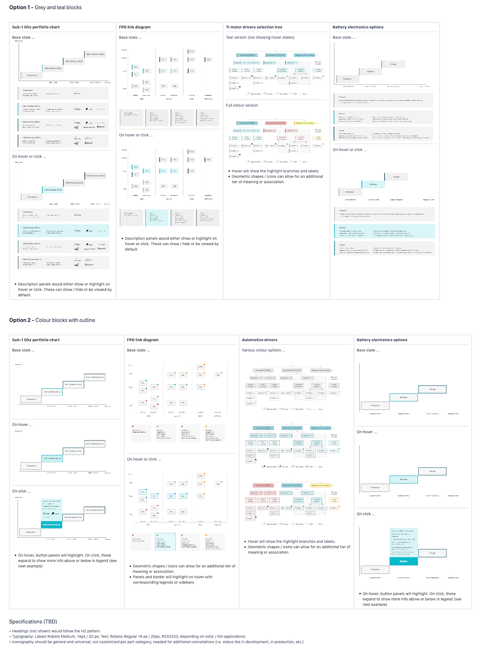

  • Mid-fidelity and high fidelity wireframes of the diagrams were creating using Adobe Illustrator.
  • TI's Brand guidelines (color foundations etc.) design system guidelines were followed throughout.
  • The idea was to create a very simplistic diagram framework which could be easily translated to code and could be edited by page authors on AEM.
  • Repurposing and reusing existing components and pattern while maintaining their integrity and creating uniqueness in the new feature elements was kept in mind.
  • Challenges


  • X-Y axis Interface Pattern: Finding a common ground of style for the diagrams was quite challenging as the existing diagrams were of varied nature with a lot of valuable data. This was resolved by actively collaborating with the engineering team - product SMEs, Field engineers to better understand the product and how it is perceived by target audience/users. Insights from recorded user interviews and testing sessions to understand the nature of information users need to make product related decisions. for example insights like "Users always seek data in a comparable format as it helps them figure out which is the latest product, what are the product efficiencies on various parameters etc." Wireframes and mockup explorations/iterations also helped to zero-down and brought in more confidence.
  • Accessibility: Due to a limiting color palette of existing block diagram visual standards, initial explorations didn't comply with color blindness and there was struggle to get google webpage accessibility compliance. To resolve this, hues from tertiary color palette and primary palette were brought to the same intensity so that they indicated contrast with subtleness for both color blink and non-colour blind users.
  • The effort required active collaboration between various teams in a big organization consumed a lot of time in to-and-fro feedback gathering and getting a slot in their calendars. The standard was also to be rolled out to various product teams (amplifiers, sensors, microcontrollers, multiplexers etc.) for their respective product portfolio, so it wasn't a one-of-a-kind solution, rather a holistic one. This means expressing priority and bringing various product owners how such a change can be benefit to everyone.

  • Outcomes


  • The visual design and UI interaction (x-y axis diagrams, product button colours and states) of product portfolio visualization feature served as the base for creating a common component for product portfolios for rest of TI product categories.
  • Since the end portfolio diagram is now built as an html/css, its easy for page authors to make edits when a new product was added/removed. This saved a lot of time as earlier a visual designer had to manually create a brand new diagram and accomodate ad-hoc edits which was a time consuming process.
  • User testing results showed better page interactivity by users and they were able to explore sub-categories with ease resulting in a better user journey to the cart.


  • Something nice:
    Translating the design to development came with least roadblocks. This was possible because I tried understanding the limitations and the possibilities by close association and conversation with dev teams beforehand. They knew exactly what to expect when the design was transferred to them for production. I also tried to provide them with files in formats like SVG which they could directly derive a code from and make edits thereby reducing dev time, understanding of the AEM page's 12 column grid made it easier to layout the diagram visual in the right aspect ratio and proportions.

    Something not-so-nice:
    Since the products are from a semiconductor space, it takes a while for non-electronic engineering background folks to understand product data. It took me a while to get a hang of the subject/topic which I feel was a bit time-consuming. I think it is more easier for people who have spend more time in this industry.


    Literature cover thumbnails


    Developed a template to bring consistency in the visual representation of literature cover thumbnails. I conducted a UX/UI audit to understand the discrepancies and discovered that literature when generated by an oracle yoda database system would automatically populate the first page/image as the cover. These when showcased on TI.com lacked affordances meaning they were not able to indicate users that they are clickable PDFs. Some of them didn't comply by visual image specs of 3:4 (were wither in random sizes or a 4:3 ratio) and resulted in non-brand compliant, data heavy cover images which were not brand, design system compliant and caused confusion to users. To resolve this, I created a template with TI's platform bar and an area for image plus a shadow effect element for affordance so that the cover looks like a book cover that can be opened and viewed

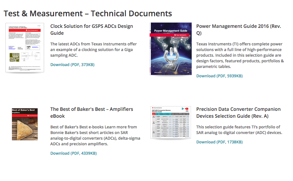
    Before - literature cover thumbnails (2nd row) in varied sizes, didn't follow 3:4 aspect ratio and lacked brand elements

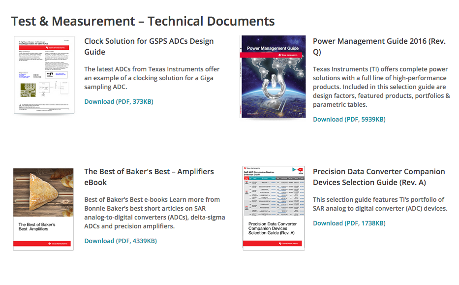
    After - created a template to streamline literature cover thumbnail imagery ensuring visual consistency, improving affordances
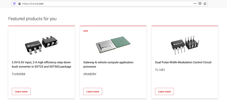
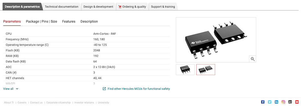


    Product imagery


    Defined product photography and illustration guidelines streamlining product photography, ensured technical accuracy. I co-managed the project of rendering more than 2000 TI products semiconductor chips which added value by improving technical credibility and visual appeal. It ensured product is showcased in its full potential. Unlike previous illustrations, these 3D illustrations were created using Autodesk Fusion 360 with front and back views, providing the user a better idea of its characteristics and features (no. of pins, material type etc.) thus facilitating better buying decisions.

    Improved 3D illustrations of chip shots with front and back perspectives

    3D chip in a product page adding value to parameters

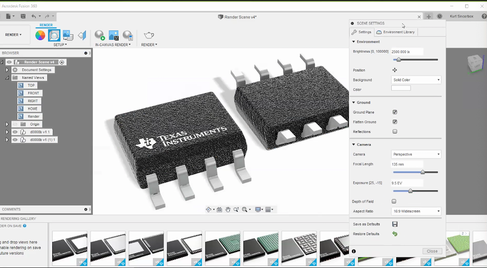
    Rendering of hipshot in progress in Autodesk Fusion 360

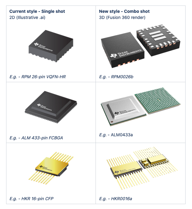
    before (2D) and after (3D) of chipshot illustrations