Design system
Role |
UX/UI Designer |
For |
Texas Instruments |
Type |
UX/UI, Design system management |
Design system
During my 3+ years as a Digital image designer (UX/UI) at TI, I co-owned visual imagery and was part of their in-house design system which followed a mix design governance approach of centralized and federated models.
Here are some of the key areas where I held responsibility, was accountable and actively contributed -
p.s. For ease of explanation, I'll use iconography as an example here.
Visual consistency
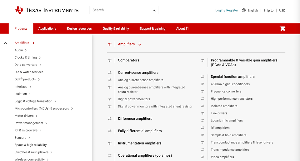
In a large company as TI, the presence of siloed teams working with disjoined communication was quite inevitable. An organization-wide design system and governance ensured visual consistency across products and departments.
As a visual and UX designer, I worked with various silo teams in educating them about the power of a design system and brought them onboard for a visual design revamp. I also lead the team to create a process (Jira workflow) to ensure TI iconography goes through proper reviews (UX/UI, Technical, Global) thus verifying consistency and quality.
I found that the common reasons for visual inconsistency in TI.com were -
Here are the before and after states of icon consistency -
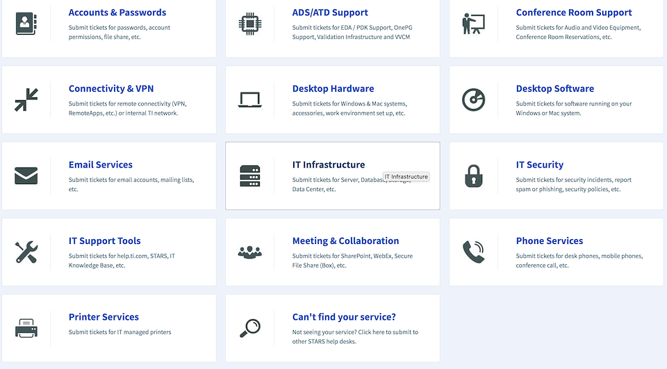
help.ti.com (before)
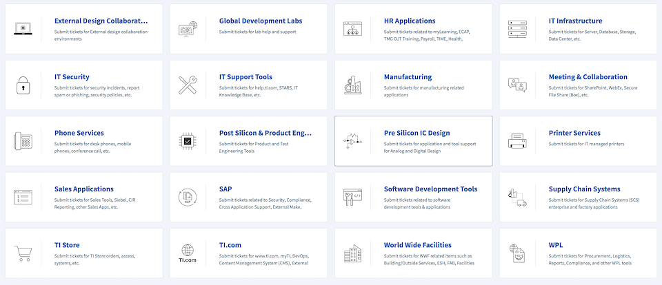
help.ti.com (after)
UI audit
Creating a design system is easier than maintaining and sustaining it. I conducted extensive UI audits - researching, examining heat maps and highlighting use-case pages with significant inconsistencies, re-classifying existing visual elements in style/component libraries, and re-structuring assets in AEM DAM. This helped in maintaining sanity in the system.
Here are some of the key things I found for illustrative icons during my discovery and research -
UI audit discovery/research stage - example of inconsistent icons on TI.com
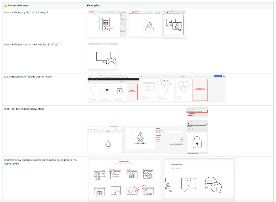
screenshot of flagged issues during UI audit documentation
icon refinement examples - ensuring consistency of shape, stroke, fill/unfill and upgrade of device shapes
Faster iterations
In a company which is large scale, geographically diverse and has taken over multiple other companies, the number of webpages are in hundreds and the number of screen iterations that need to be done are in thousands. Creating a brand new element is time consuming and using a placeholder doesn't make the look-and-feel authentic and makes it difficult to visualize screen. In a stakeholder meeting, this can cause more damage in communicating a design message than supporting it.
As a digital designer on the design system team, I created highly organized, up-to-date libraries of UI assets that could be easily used by fellow ux designers (in UXPin and design system microsite) and content authors ( in AEM). This helped reduce iteration time by providing designers and content authors with a ready-to-use library and ensured they were using updated assets.
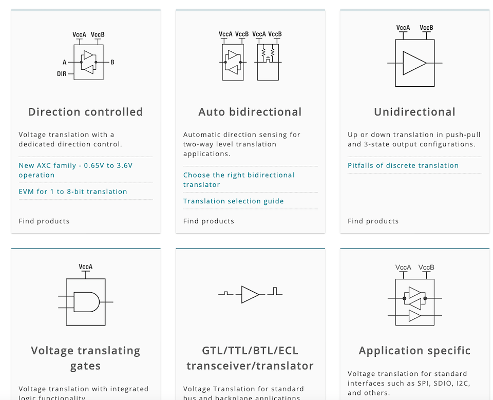
Here is an screenshot from the 'action' based UI icon library. A few icons are labelled as deprecated (no longer in use and are replaced by a new one) so that designers don't end up using them
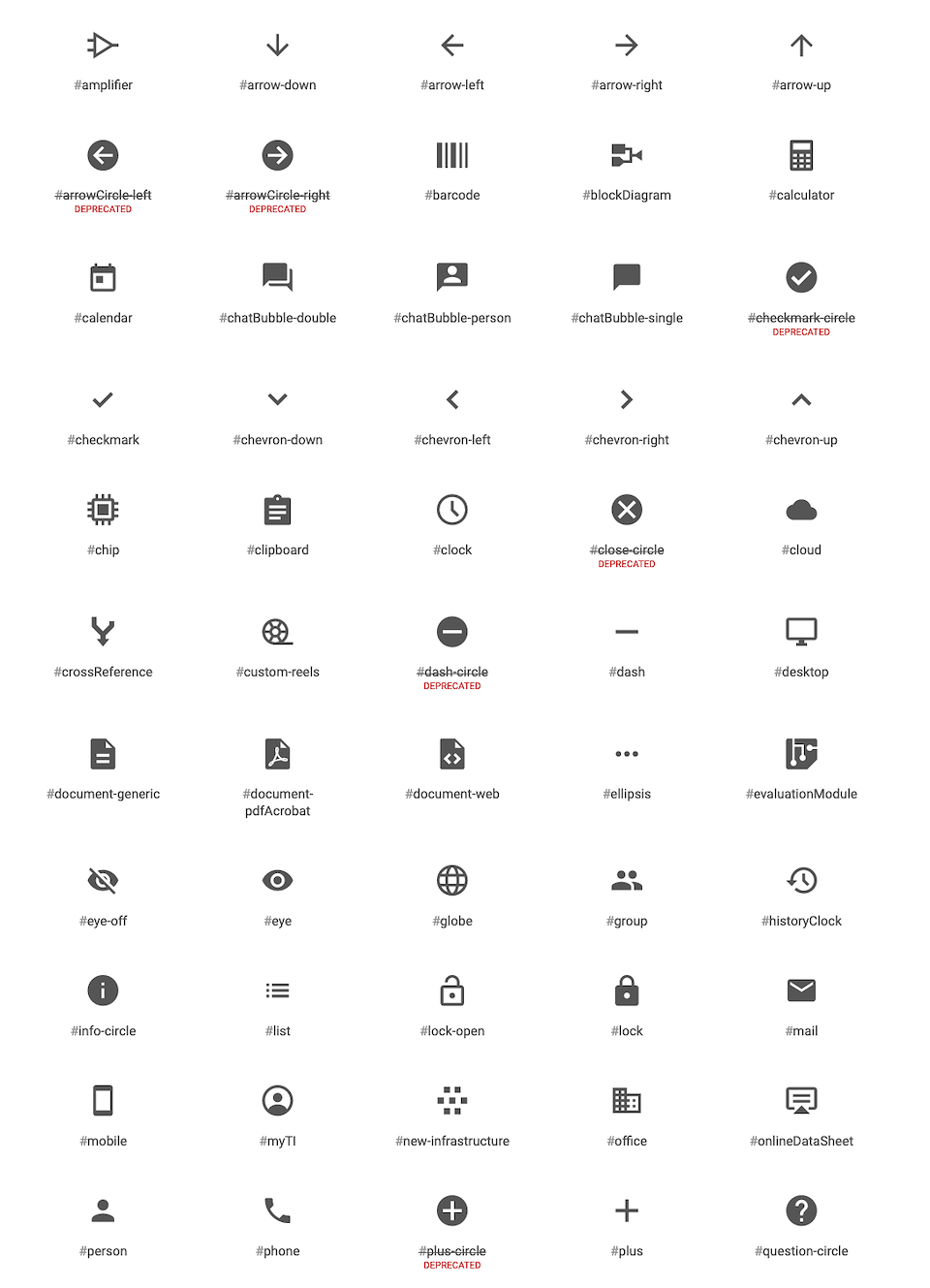
UI icon library - screenshot
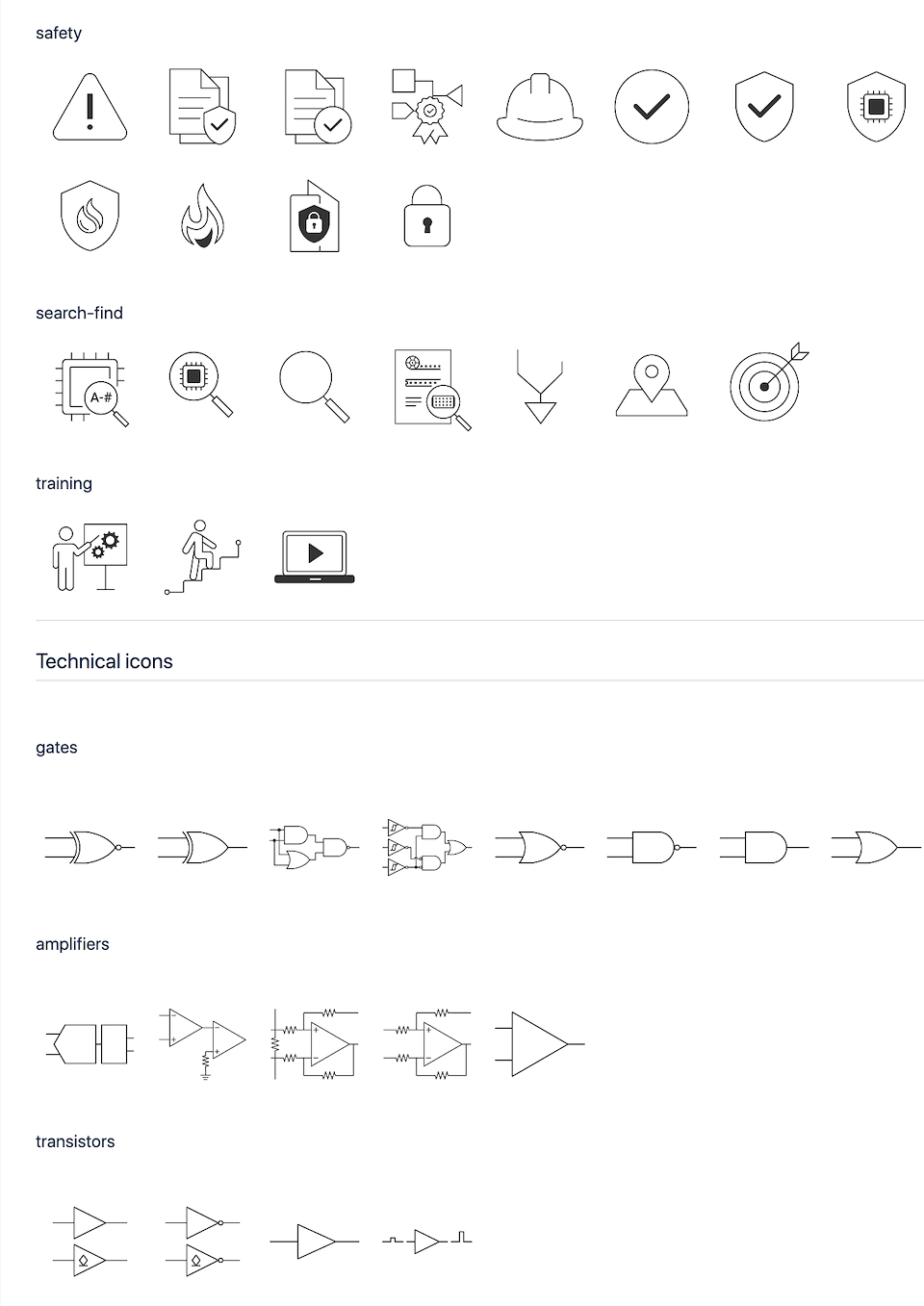
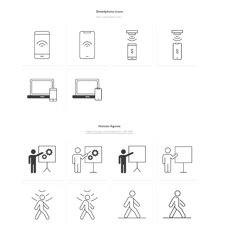
Illustrative icon library - screenshot
Enhanced visual language
I created iconography to enhance TI's visual language benefiting product identity, content identification, and helping users to navigate better through various product experiences.
Each illustrative and UI icon request is thoroughly analyzed and triaged. Design thinking and conceptualization is done and symbol options are created. These are then internally UX/UI reviewed to check for reusability and the ones which convey the messaging appropriately are chosen. Throughout the process, business/engineering teams are kept in the loop for feedback and Technical reviews for technical accuracy of symbols. The icon also undergoes a Global review where a team of global reviewers ensure that the symbol is culturally appropriate (isn't offensive in any culture worldwide)
open envelope illustrative icon to support text content for sign me up
package icon on product picture overlay to indicate that the user is going to view the package as a whole
Tune UI icon to indicate that the products the user is going to view next are customizable
Tune UI icon later helped in acting as a bullet in the product info architecture
technical icons supporting technical content
file-link icon created by reusing link and file icons for a literature PDF use-case to Indicate the user that the content is a 'direct-link'
Design system as an educational tool
Educating a team about a design system is as important as creating a design system. I wrote robust and easy-to-follow usage guidelines and best practices for visual imagery components (like iconography, product showcasing, banners, literature covers, third-party assets etc.). This helped in seamless on-boarding of new designers or individual contributors like digital marketing managers/page authors who are new to UI.
I also acted as a bridge between design and non-design teams (or anyone who could benefit) by routinely presenting to non-designers about 'why and how to use our design system. This brought people from various backgrounds come to the same page which further helped in making better business designs, while prioritizing UX/UI design.
Imagery in UX design system
As a co-owner of visual imagery under TI's design system umbrella, I helped in building an immersive experience for TI.com users by creating accurate, relevant, high-quality, technically credible digital image assets.
Besides iconography (illustrative + UI), here are the other areas of visual design that I was responsible for.